


Imagine this..
For the past 5 years, you have been a resident of Atlanta, and like most other residents, you use platforms outside of the government website to pay bills, look up voting information, and stay in touch with events in the city.
You have never thought to look at the city’s website.
Enjoy Atlanta !
As a government run website, the City of Atlanta webpage offers various features to support its residents from paying their bills to providing recreation activities to do throughout the city. While researching the website along with other city websites, I found areas to improve the user experience for residents and visitors of the city.
OVERVIEW
Long story short.
Context
Focus on Discovery Process
Tools: Excel, Notion, Miro
Duration: January-February 2023 (4 Weeks)
My Role
Research Analysis
GOAL
Assess any usability issues, evaluate comparative websites, and make recommendations to improve the website of the local Atlanta government.
The fundamental part of this project was in gathering usability research of the current website. I found the best way to understand the overall usability would be to use a Heuristic Evaluation, taking apart the website piece by piece.
RESEARCH
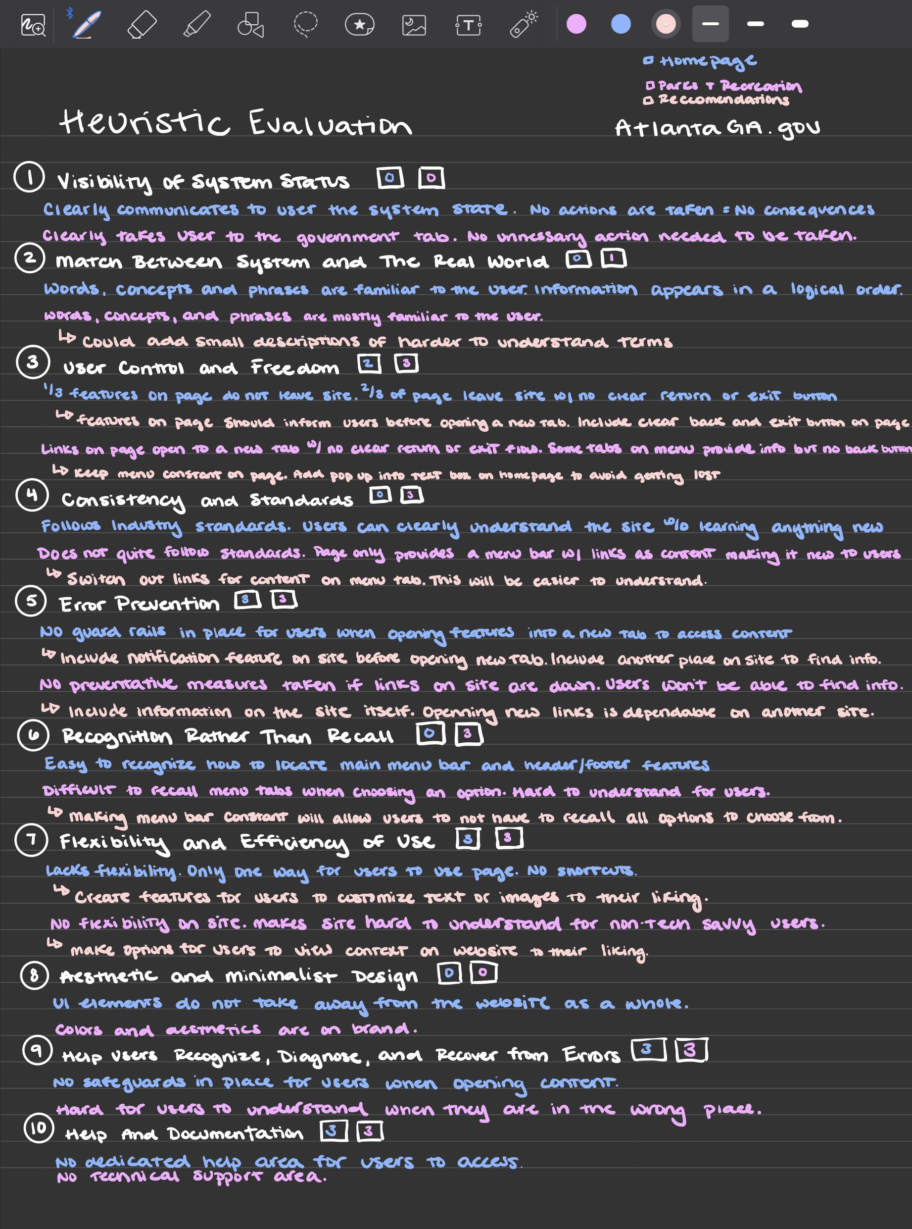
HEURISTIC EVALUATION
Images shows the Heuristic Evaluation of the Homepage and Parks + Recreation Page.
Complying with time constraints for this project, I decided to focus my research on two pages of the website: Homepage and Parks + Recreation.
While completing the evaluation, I found a variety of problems in usability on both pages, resulting in a high score making the usability of each page bad. I provided recommendations for each of these principles regarding adding small features to ease the understanding for users and provide value to their experience.
From here, I decided to compare similar city websites to gain a better understanding of the industry and how they were presenting information to their audience. This will help me provide better recommendations to guide the City of Atlanta’s site.
To give the best comparison between websites, I decided to compare cities with similar size and population as well as similar density. This ensured my research was cohesive and applicable to use throughout the project. The cities I chose were: Detroit and San Diego.
COMPETITIVE ANALYSIS
This part of my competitive analysis focused on the features of each site. I found this important because these features are essential elements of each site that users will use to navigate throughout.
I found it interesting that Detroit’s website has less pages and features compared to Atlanta and San Diego. This made the user experience on the Detroit’s website a bit harder to navigate compared to the other two.
Feature Analysis

Image shows feature comparison of Atlanta, Detroit, and San Diego.
This part of my competitive analysis focused on the layout of each site. I found this important because the way the information on the websites are presented play a crucial role in a user understanding.
I found it interesting that San Diego presented their events in an event finder format, while Detroit did not have one all together. This led me to research Atlanta’s layout of event information, only to find that it is presented as a listing making it harder to navigate and understand.
Layout Analysis

Image shows layout comparison of Atlanta, Detroit, and San Diego.
From these competitive analysis, I am able to conclude the best website overall (including usability) is San Diego’s - it includes relevant information for current residents and information for visitors. The website is up-to-date and information is presented in a way users are able to easily access it and navigate through.
My favorite part of San Diego’s website is that it was built with user’s personalities in mind.
This led to focusing further research on user’s behaviors,and motivations towards events and lifestyles in Atlanta, GA.
PROJECT DIRECTION
To gather a cohesive understanding of what users are looking for in the City of Atlanta’s website regarding event information, I decided to conduct user interviews.
These interviews took place on Zoom and were recorded both on audio and visual. Interviews were approximately 10-15 minutes long and were semi-structured.
USER INTERVIEWS

Before collecting user interviews, I created a Discussion Guide to ensure the interview would stay on track and collect the necessary data needed, however it left room for responses that were more interesting to learn about.
I created a Screener Survey to identify and access the ideal users for research purposes based on specific criteria determined by the user research goals.
Screener Survey
Image shows screener survey responses.
I had 6 users filled out the screener survey, but only 4 were eligible to participate in user interviews.
The eligible users for this research study are users that live in Atlanta and do not used the Atlanta City Website to find information on events happening the city.
I would’ve liked to interview more participants, however I had a limited pool of access for research participants through my cohort.
During the user interviews, I took notes and recorded the responses of each participant to gather into an Affinity Map. This felt to be the best way to visually represent the behavioral data collected and would then help me draw insights from to use to create strategic recommendations for event information on the website.
RESEARCH SYNTHESIS

Image shows the Affinity Map created on Miro.
Once noting all the responds on the Affinity Map, I then grouped each of the statements into their natural relationships. Using these groups, I created “I” statements to help build the user persona for this project:

Using the “I” statements, I created the user persona, Sarah Momin. She represents the target audience for this project using the research participants demographic information and beliefs.
USER PERSONA

From the User Persona, I was able to jump into creating a Journey Map to discover an area to improve the information hub on the City of Atlanta website.
Image shows the User Persona for this project.

JOURNEY MAPPING
This Journey Map explores the actions, emotions, and mindset Sarah is in as she learns and goes to an event in the Atlanta area. While creating this, I was able to understand and address her customer needs and pain points through this process.
This helped me to find a window of opportunity on the City of Atlanta webpage to incorporate an information hub for events.
Being a tech savvy user, she is familiar to receiving notifications on her phone and responding in a timely manner. This creates a Window of Opportunity for creating notifications on her phone to notify her of events coming up in the city.
Her main problem focused on scrambling to find information on upcoming events and the tickets associated with it. This led me to creating my problem statement for this project.
Image shows the Journey Map for this project.
Using the problem statement, I put myself in the users shoes and imagined what they would want to see. Using a mind map, I explored the different areas that a user would be interested in relating to events in the City of Atlanta.
POSSIBLE SOLUTION

Mind Mapping
Through the mindmap, I learned a user would be interested in having all event related information like ticketing, safety concerns, and social media pages in one area. This would provide some ease in their thinking to make the decision to go to an event.
With this information, I designed a storyboard of what a user would accomplish with this solution on the City of Atlanta’s website.
Image shows the Mind Map of a User.

Story Boarding
Image explored the Story Board of the solution in practice.
👋 Final Thoughts
This project was my first completed in the user experience bootcamp. Walking into the bootcamp, I was familiar with the major concepts of design thinking, and I had used outside resources, like Youtube and TikTok, to learn smaller aspects. With this project, I enjoyed being a part of an instructor-led course in which we were taught these different ux research artifacts and had a chance to practice them on real-world examples. I enjoyed being able to explore these artifacts on my own and add my own creative spin on each. The most important skill I learned from this project was how to create a strong foundation of UX research. Because of this, I was able to create a solid proposed solution with research to back my findings. Overall, I gained a much better understanding of the UX design process and am excited for my next project.
Next Steps ➡️
Iteration and Design
Since the proposed solution has been decided, it is ready to enter the prototyping phase. In order to effectively design the solution, it must go through a series of wireframes. These wireframes must include different iterations of Enjoy Atlanta!. There are many ways the design could go, and this stage is where designers can work through different design solutions.
Prototype and Roll-Out
Once there is a final design, there must be a prototype made to test against users. This will ensure the projects solution solves the problem. Finally, there must be a coordination team to ensure the information on the website stay up-to-date.

