Sparkle Website Redesign
Project Scope
Website Redesign, Branding
Tools
Excel, Sticky Notes, Procreate, Figma
Role
Marketing Researcher, UX/UI Designer
Team
Self directed, with feedback from mentors and peers
Duration
6 weeks
Overview
Georgia Pacific is a one of the world's leading manufacturing companies of tissue, pulp, packaging, building products and related chemicals. Sparkle is one of its subsidiary consumer brands, and it offers sustainable paper towel products of different sizes and prints. This consumer brand targets consumers' need for clean households and basic sanitizing needs.
Why this project?
Redesign website for better usability for consumers.
Enhance website for users to educate themselves better on sustainability
What was I tasked with?
Project Description 💻
Success Metrics 🎖
Track the percentage of visitors who navigate away from the website after viewing only one page. A lower bounce rate would suggest that the redesign is capturing visitors' attention and encouraging them to explore further.
What would success look like?
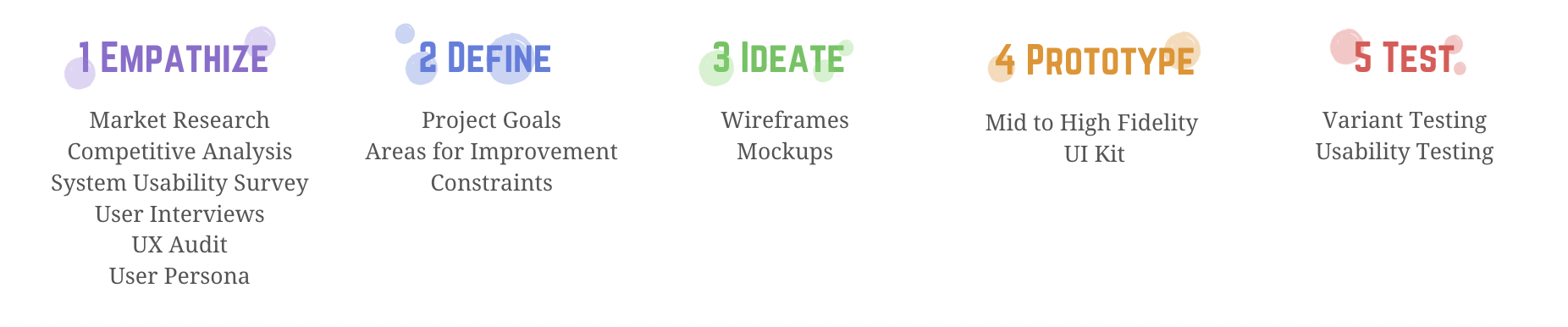
Design Process
01 Empathize
Research enables me to dig deep into my understanding of users - not only their immediate frustrations, but also their hopes, fears, abilities, limitations, reasoning, and goals. It lays essential foundations for creating solutions in later stages.
Research Goals
Understand the market and identify target groups
Uncover people's sustainability effort experiences
Learn about how existing paper towel products cater to users' needs as well as their strengths and weaknesses
Learn about the preferences, frustrations, goals, needs, and motivations of target groups
Methodologies
Secondary Research (Market Research, Competitive Analysis, UX Audit)
Primary Research (System Usability Surveys, User Interviews)
Secondary Research
Market Research
Because Georgia Pacific’s website has been around for a while, it is has been able to fit into the global sustainability product and experience market for a long time. Therefore, it is important to get a big picture of the market as a whole - to get a sense of what we know and don't know yet, who the audience are, as well as what the recent trends or news are.
Selecting a product
Search engines and family/friend recommendations are more likely to be consulted; Most will use products they have grown up using at home.
Expectations on Sustainable Products
Eco-friendly related searches which include ‘sustainable’ and ‘environment friendly’ have grown by more than 329% in the past five years (Google Trends, 2020).
63% prefer to read reviews, view pictures and buy online all on the same website that offer customers a ‘one-stop shop’ (Salecycle, 2020).
72% of new customers won’t buy until they have seen the product in use (Salecycle, 2020).
Future Trends
70% of homes would be more likely to buy products if they knew it was eco-friendly (Trekksoft, 2019).
Over half (54%) of sustainable homes want to play a part in reducing their carbon footprint (Booking.com, 2019).
Demographics
Young homeowners, particularly Gen-Z and Millennials heavily trust and rely on sustainable products in their home (Salecycle, 2020).
67% of high-income families would prefer to spend their money on eco-friendly products (Salecycle, 2020).
For eco-friendly families, 95% said their priority was to teach their future generations how to reduce, reuse, and recycle household items.
View Full Market Research Here
Competitive Research
It is equally important to research other companies in the industry that pioneer in the paper towel market, as their solutions to similar problems will help me gather insights about their strengths and weaknesses. These insights also help me identify any gaps in features that Sparkle might address. I used a theme board analysis to analyze 3 direct competitors, who are trying to solve the same problem with us, and 1 indirect competitor, who shares the same industry.
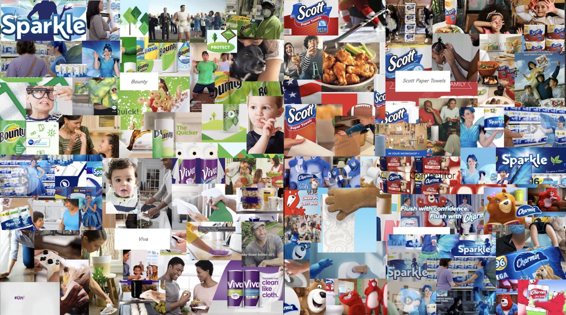
Brands use mascots and vivid colors to stand out in the industry.
Most brands use customers in their visuals to relate to customers.
Brands use easy to understand language in advertisements.
Brands focus on their product offerings.
Some brands touch on sustainability efforts with products.
Insights
Needs
Users need to be able to trust a brand to use it regularly.
Users recognize brands based on advertising and personal history.
Users enjoy seeing the product in use.
Users are more likely to engage with brands that are personable to them.
System Usability Survey (SUS)
Because Sparkle’s website has been online for a while, I needed to gather current usability research to understand and assess how users feel about the site before changes. To create a baseline benchmark for usability, I asked 10 participants to rate 10 different statements on a scale from Strongly Agree to Strongly Disagree. For a website to be considered usable, the score must be above a 68.
After collecting the data, I used Excel to calculate the qualitative data using the SUS method to quantitative data. The final score was 47.75 causing the current website to fail in usability.

User Interviews
While conducting the System Usability Surveys in-person, I was able to note feedback from participants and ask questions about their experiences with paper towel products.
Interviews were based on open-ended questions. Interviewees included :
4 males, 6 females
Age: 24 - 32
Duration: 12 - 20 min

It was fascinating to learn about what areas of interest users had and wanted to see improvement on. The top 5 comments received related to Loyalty Programs, Map Features, Brand Differentiation, Product Differentiation, and Family Values. I was able to use this feedback to create my user persona.
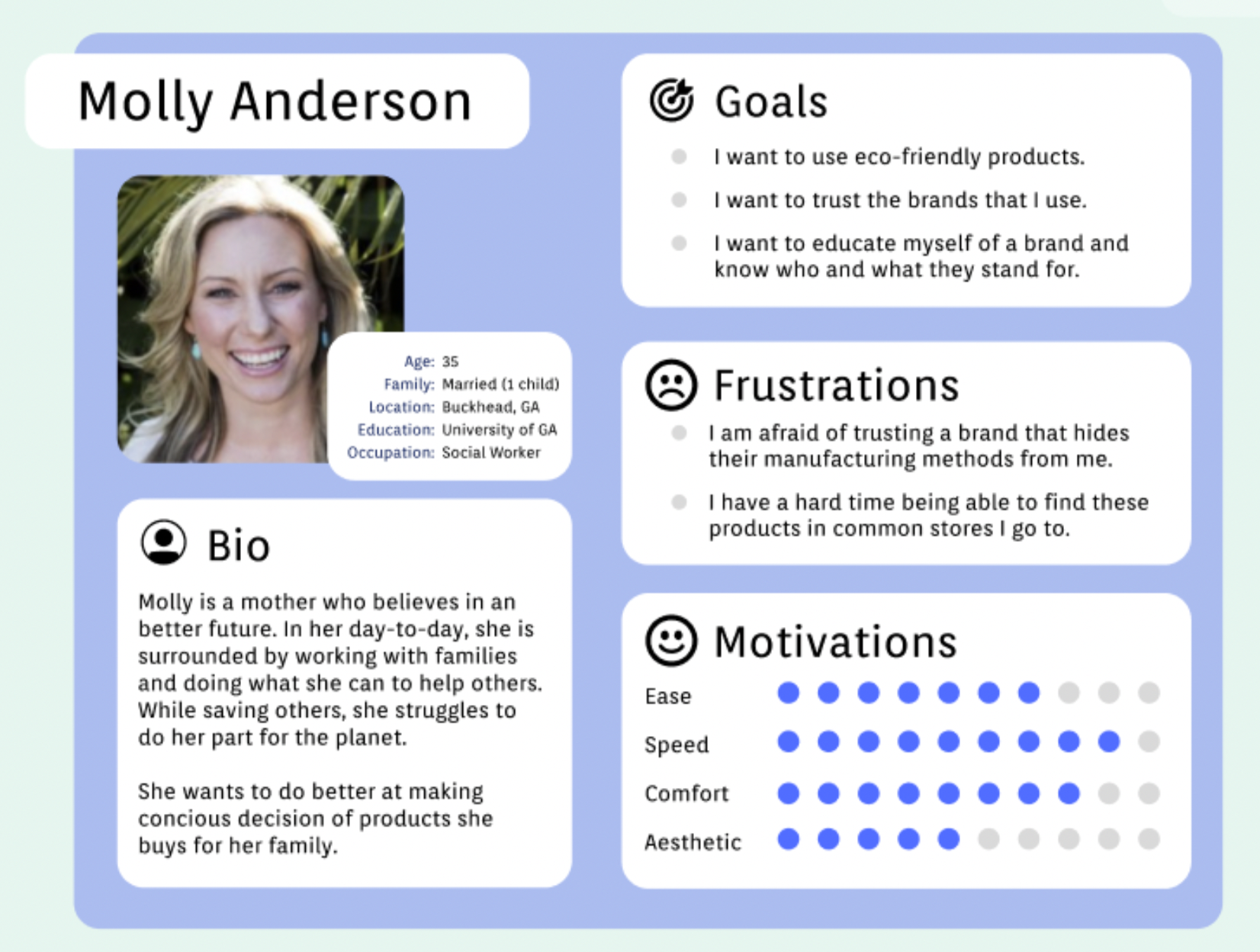
Meet Molly Anderson !
Since I have gathered a bunch of knowledge of the audience, as well as their goals and needs, I use the user persona to represent key audience segments. It helps me focus on tackling the most important problems – to address the major needs of the most important user groups. It is both fictional and realistic.
Let’s meet Molly, a 35-year-old Social Worker in Atlanta, GA. She is a mother who believes in saving the planet any chance she gets. Every day she works to make a person’s life a bit better, so when she is home she loves to focus on making the planet a bit better.
UX Audit of Current Website

Finally, before redesigning the different pages on the website, I completed a UX Audit to explore the various issues on the website. The yellow sticky notes layout the issues on each page of the website.
02 Define
Project Goals
In Define phase, I take the data gathered from Empathize phase, generate knowledge out of data, and prioritize insights and needs that allow me to target specific problems. Listing project goals can help me form a clear overview of the product, pave ways for determining product features, and make the proper decisions.
Create a better user experience for customers looking to buy paper towels in various sizes.
Enhance the visual hierarchy of information on key pages of website.
Redevelop better landing page for users to learn about brand in 5 second scanning of site.
Areas for Improvement
Based on the UX Audit research, I was able to determine the following 6 areas for improvement:
Clunky UX : Chaotic eye movement, images scrambled on website, no alignment. This causes the content to be detached and no cohesive movement.
Visual Hierarchy : Messy information hierarchy (alignment, different component heights). This causes information to be lost when scanning the page.
50 Shades of Buttons : Too many button features and only one font type. This causes information to be hard to find.
Loss of Features : Impossible to understand the difference of product offerings. This causes confusion when deciding which product fits needs best.
Missing Features : Sustainability tab for brand to educate users on its unique features.
Requirements
Clearly defining the requirements of this project helps me to create the best solution for this brand. This project requires a simplified website navigation with direct areas for users to find information. The design also needs consistent design features along with quality consumer driven visuals, such as user generated content from social media. Finally, the white space on the website needs to be used effectively overall.
Constraints
Before diving into the Ideation phase, I need to remind myself of my project constraints. To me, constraints outline the box I need to come up with a solution for. This will allow me to think of ideas “outside-the-box” and work with the constraints to create the best possible solution. Constraints for this project include :
Branding Constraints : Because this is project is done outside the scope of Georgia Pacific, I can not change essential branding elements including the logo, the mascot, and the brand colors.
Financial Constraints : Because this project is being done on a post-college student budget, I was not able to collect a diverse amount of research. However, I recorded as much information I could and created a project.
03 Ideate
After having a clear definition of the problem, I sketched paper wireframes on GoodNotes on my iPad. Paper wireframes are the best way to quickly create and can express ideas fast as they come into my mind. These wireframes became low-fidelity prototypes with a consistent header and footer sections from the original website since the branding was the most important element here.

Home Navigation Mock-Ups
Product Information Mock-Ups

Sustainability Mock-Ups

Location Screen Mock-Ups
04 Prototype
Mid to High Fidelity

Home Navigation

Product Information

Sustainability Screen

Location Screen
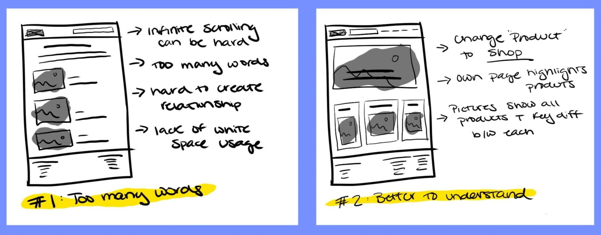
After creating the low-fidelity mockups, I decided to go through each mockup to highlight its strengths and weaknesses. When doing this, I noticed that some elements from one mockup worked better with another. This is where I designed a final low-fidelity mock-up and transformed them into high-fidelity prototypes.

Build a UI Kit
After creating the final prototype, I collected all the UI elements I designed on the website and put them together in a UI kit. UI Kit is a compilation of existing UI elements on the website that provides references for future design and collaboration for the design team. It is also a living document and will be updated whenever there is an iteration of the design.
05 Test
While creating the mock-ups, I had a hard time deciding if the current pop-up for coupons was the best solution for users to sign up with. This caused me to create two different variants of the coupon feature. One variant included a button with a pop-out screens to fill out the coupon form. The other variant had users move to a different page of the website.

Variant A

Variant B
From here, I recruited another 10 participants to test the two variants, as well as complete a final System Usability Survey. This survey I asked the participants rate 10 different statements on a scale from Strongly Agree to Strongly Disagree. There also included a section to track the attitudinal data of the two variants.
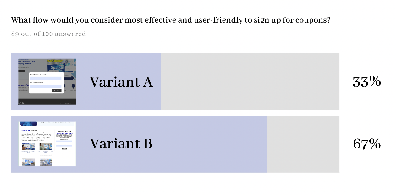
Attitudinal Data
The attitudinal data shows that Variant B - where participants are taken to another section of the page, was 67% preferred over Variant A.
When asked why participants chose this, they said it gave them a chance to learn more about the brand before sharing their personal information.

Final SUS Score
The final System Usability Survey score was 82. Because the score is above the industry standard of a 68, this made the website prototype usable.
👋 Final Thoughts
This is my first UX design project where I applied design thinking. It was really difficult, but I had a lot of fun throughout the process. Apart from gaining precious experience from user interview that allowed me to collect direct user input, the most important skills I learned was to rationalize every design decision by solid research that minimizes gaps. I also found the usability testing very helpful that uncover usability issues neglected by me as the designer. Overall, I gained much understanding in the UX design process and e-commerce business.
Next Steps ➡️
Design Implementation & Handoff
Since the design has been tested and revised, it is ready to enter the development phase. In order to effectively communicate the design to developers, I redlined and organized my design deliverables using Zeplin for handoff, and prepared to assist with any follow-up questions.
Maintenance
Updates and revisions will continue to exist in the future, and I will address them based on the priority levels.