Umbrella : An App for Nonprofits
Project Scope
Website Redesign, Branding
Tools
Excel, Sticky Notes, Procreate, Figma
Role
UX/UI Designer
Team
Self directed, with feedback from mentors and peers
Duration
3 weeks
Overview
Giving back to communities has been engraved in me since I was young. This project allows me to explore my design skills and create a mobile app for nonprofits. Umbrella aims to be a condensed space for users to find and donate to nonprofit organizations. This mobile app will be a place to find accurate and updated information for users to learn about global issues that they are passionate about.
Why this project?
Project Description 📱
Design a mobile application for nonprofits to centralize on for users to donate to.
Provide non-profits a space to inform users of various donation platforms verified by their organization.
What was I tasked with?
Success Metrics 🎖
Measure the number of times the app is downloaded or installed. This metric provides an initial indicator of user interest.
Monitor user reviews and ratings on app stores. Positive ratings and constructive feedback indicate user satisfaction, while negative feedback highlights areas for improvement.
What would success look like?

Design Process
01 Discover
User Research
I decided the best way to research this project was through User Interviews. This was an essential step in developing a successful nonprofit app that allows users to donate. The goal of user research is to understand users' needs, expectations, and pain points, which can inform the app's design and functionality.
To conduct user research, I asked over 400 people outside of Walmarts, Whole Foods, and the local mall to be participants of my interview. These interviews were structured to gather insights about users' motivations for donating, their preferred donation methods, and any challenges or concerns they may have.
During the interviews, it was important to ask open-ended questions to encourage participants to provide detailed responses. Questions included, but not limited to:
Why do you donate to nonprofits?
What types of organizations do you typically donate to?
What do you look for when deciding which nonprofits to support?
How do you prefer to donate (e.g., one-time donations, recurring donations, specific campaigns)?
Have you ever encountered any difficulties when donating to nonprofits online?
What features or tools would you like to see in a nonprofit donation app?
The insights gathered from these interviews can help inform the development of the app's features, user interface, and user experience. For example, I learned that participants expressed concerns about the security of their personal information or payment details. This made me keep in mind that the app needed to be designed with robust security features to address those concerns.
02 Define
While collecting the qualitative data during user interviews, I also made sure to have participants fill out demographic information. This helped me to build my user personas for this project.

Meet Jamie Pham
She is a 26 year-old financial analyst who is a social activist that believes there is only one race, the human race. She actively donates to nonprofits when she can.

Meet Robert Quinn !
He is a 32 year-old journalist who donates to nonprofits he can trust to send money to. He will do research on the organization before engaging with it.
After creating the user personas to holistically represent my user research, I was able to define the target users for this mobile application. By defining the target user, I am now better able to create a design solution for this problem.
03 Develop

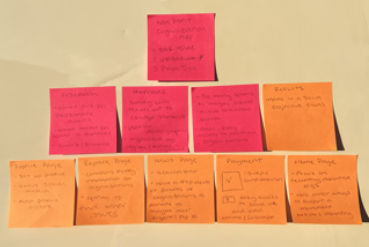
Paper Wireframes
Creating wireframes is an essential step in the mobile app development process, as they help to provide a visual representation of the app's structure and layout. In this case, Sticky Notes were used to highlight all key screens for the nonprofit app, allowing for a clear and concise overview of the app's functionality.
From there, a paper wireframe was created as a quick way to sketch out ideas and determine the most effective frames to use in the app. The paper wireframe provides a rough sketch of the app's design and functionality, allowing for early feedback and modifications. This step is important in ensuring that the app's design aligns with the user's needs and preferences, resulting in a user-friendly experience.
The wireframes that were chosen were those that made the most sense to users and aligned with their needs and preferences. This was determined through user research, where potential users were asked about their preferred features, user interface design, and other factors that could impact their overall experience with the app. Based on the insights gathered from this research, wireframes were created to incorporate the most important and relevant features for the users.
04 Deliver
Low to High Fidelity Prototypes
After the wireframes were chosen, the next step was to create a low-fidelity prototype using Figma. I focused on the layout and functionality of the app rather than the aesthetics.
Then, a high-fidelity prototype was created to incorporate images, colors, and text to provide a more realistic representation of the final app's design and functionality. This prototype allowed me to test the final look and feel of the app, including the aesthetics and user interface design.

Branding
The idea behind “Umbrella” is how an umbrella is used to shield you from the rain on a pouring day. In this case, each donation is considered an umbrella, or if you decide to split your donation, you would be splitting up your portions of the umbrella to shield others from their rain.
👋 Final Thoughts
In my first UI design project, I was thrilled to have the opportunity to apply my creativity more than the technical aspect. However, I faced several challenges while creating the final product due to limited user research. Looking back, I realize that spending more time in the Discovery phase and conducting a competitive analysis of similar apps in the industry would have been beneficial. Additionally, gathering more market research before jumping into solving the problem would have made the development phase smoother.
Despite these challenges, I am proud of the work I accomplished in the UI design portion of the project. I thoroughly enjoyed creating the aesthetics and branding materials for Umbrella. One of my favorite parts of the project was crafting the name and color scheme. As a seasoned graphic designer, designing the logo in Procreate came naturally to me.
I acknowledge that there were areas for improvement in the project, but I am confident in my skills and believe that I did an outstanding job in the UI design aspect. I am excited to continue learning and growing as a designer and applying my skills to future projects.